YouTube launches redesigned homepage
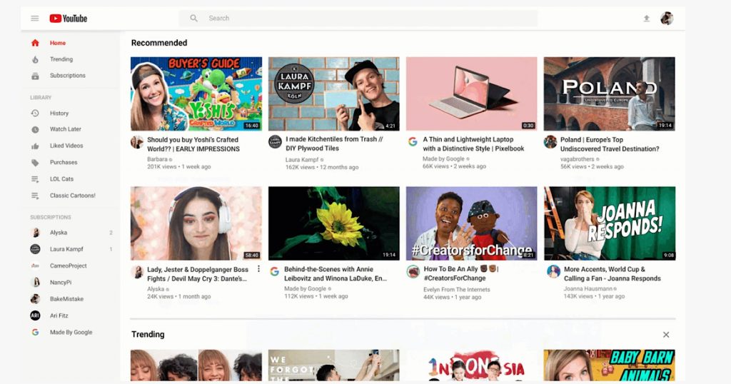 YouTube has launched a redesigned homepage that will shower fewer video thumbnails in more details.
The Google-owned company initially tested the new look in August and it received mixed feedback. Critics of the tested update were frustrated that videos were no longer grouped by categories which made the site look unorganised and that the bigger thumbnails make the site more difficult to scroll through.
The newly-launched redesign is essentially the same as what was tested with some users in the Summer with a couple of additional features.
In a blog post, YouTube said that this new “cleaner design” provides “longer video titles and larger, richer thumbnails to give you clearer information about the video at a glance.”
The blog also notes that while it has removed content shelves – which showed similar videos by genre, topic or channel – rows of videos for “breaking news, music mixes, and more” can still be found elsewhere on the site.
One important new feature is the ability to tell the site that you aren’t interested in a particular channel so that its videos are no longer recommended to you. This is a feature that was earlier introduced on mobile so its addition to the desktop YouTube experience makes sense.
The other feature is the ability to add videos to a queue, letting users add videos to watch without interrupting their current viewing.
YouTube has also said that future features will include selecting topics to refine your favourite topics and the ability to customise the home feed with related vidoes.
The post concludes that the company has been “experimenting with this updated design for a few months” and that it is “excited to roll this out to everyone.”